In the early days of the internet, as a website builder, you had a choice of only a few fonts. These were also standard fonts lacking much imagination or visual appeal. The advantage of this was that you could make a quick choice, but there were, of course, disadvantages as well: partly due to the lack of attractive fonts, websites were somewhat dull and unappealing.
Fortunately, a web designer can now choose from hundreds, perhaps even thousands, of different fonts. Anyone looking at the options for the first time can quickly get overwhelmed. However, an experienced web designer with the right qualifications can quickly determine which fonts are suitable for a specific website targeting a particular audience.
Why the right font?
For the following reasons, it is important to use an appropriate and pleasant font on your website:
Readability
If you choose the right font, virtually all visitors to your website will be able to read your text without any problems. This prevents people from getting frustrated and leaving your site.
Continue reading
Using the right font increases the likelihood that people will keep reading once they’ve started. And make no mistake: that’s really not a given. After all, the internet is constantly full of distractions.
Corporate identity
Your choice of a particular font also makes a kind of statement. The chosen font can say something about your personality, your company’s brand identity, or the products or services your organization provides.
What to look for in fonts?
When you’re searching through the hundreds of available fonts to find the right one for your website, keep in mind that a font should ideally meet a variety of criteria. In that regard, try to consider the following factors:
- As mentioned above: choose a font that best aligns with the image your company wants to project.
- Never choose a font that is difficult to read. Follow the rule of thumb that if a font is hard for you to read, it is nearly impossible for people with low vision or dyslexia.
- Keep in mind that text on a screen is always harder to read than on paper. For this reason, avoid choosing a version that is too difficult to read.
- For headings and titles, it may be appropriate to choose fonts that are more difficult to read. These headings must, however, contain short text in large letters.
- For website copy, it can generally be said that sans-serif fonts are the most readable and visually appealing. Sans-serif means that there are no small lines at the ends of the letters.
- Another important consideration when choosing your font for web design is Google Fonts.
Google Fonts
Google Fonts are free fonts that you can use for the web design of your new website. Google Fonts offers hundreds of free fonts that can be filtered extensively via https://fonts.google.com/. Additionally, Google Fonts are always rendered well by browsers and load quickly, which improves your website’s loading time.
Suppose you really want a handwritten font to give the “About Us” section of your website an authentic/personal look. In that case, you can easily filter and select your favorite Google Font:
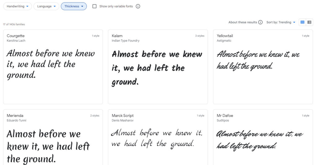
In short, there is a wide selection of (free) fonts available. Make sure your new font fits well with your brand identity and ideally choose a font via Google Fonts.